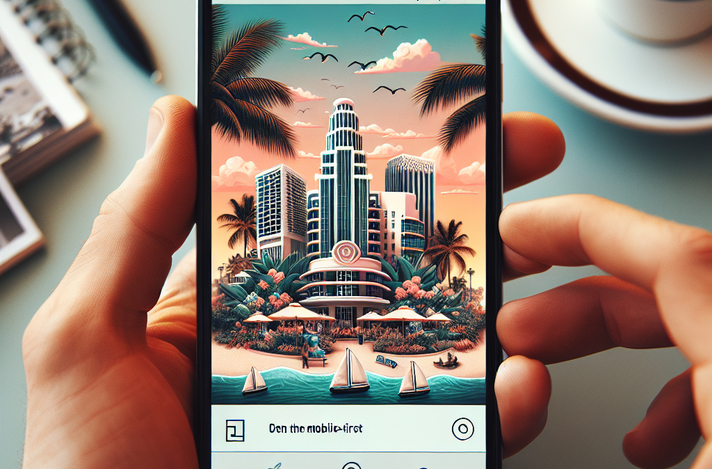
Unlocking Success: How Embracing a Mobile-First Approach Can Revolutionize Your Website’s Performance in Miami
Attention, Miami business owners! Are you ready to take your online presence to the next level? In today’s digital age, having a mobile-friendly website is no longer an option – it’s a necessity. With more and more people accessing the internet on their smartphones and tablets, your website needs to be optimized for these tiny screens. That’s where the concept of mobile-first design comes in. In this article, we’ll explore the importance of mobile-first design and how it can help your website thrive in Miami’s mobile-centric market. From responsive layouts to intuitive navigation, we’ll cover all the essential elements you need to consider when creating a mobile-first website.
As the gateway to Latin America and a thriving tourist destination, Miami is a city that never sleeps. Its vibrant culture and bustling economy attract a diverse range of visitors and residents alike. Whether you’re a local business owner or a multinational corporation, having a strong online presence is crucial to staying competitive in this fast-paced market. And with Miami’s tech-savvy population, it’s no surprise that mobile devices are the primary way people access the internet. According to recent studies, more than 70% of Miami residents own a smartphone, and over 60% use their mobile devices to browse the web. With these statistics in mind, it’s clear that optimizing your website for mobile is no longer just a trend – it’s a business imperative.
Key Takeaways:
1. Mobile-first design is crucial for websites to thrive on tiny screens. With the increasing use of smartphones and tablets, it is essential to prioritize mobile optimization to provide a seamless user experience.
2. Responsive web design allows websites to adapt to different screen sizes and resolutions, ensuring that content is easily accessible and readable on mobile devices. It is important to invest in a responsive design to cater to the growing mobile user base.
3. Speed is of the essence when it comes to mobile browsing. Slow-loading websites can lead to high bounce rates and frustrated users. Optimizing website performance by minimizing page size, compressing images, and utilizing caching techniques is crucial for mobile success.
4. Mobile SEO plays a significant role in improving website visibility and search engine rankings. Implementing mobile-friendly practices such as using responsive design, optimizing page speed, and ensuring mobile-friendly content can greatly enhance a website’s mobile SEO performance.
5. User experience is paramount in mobile-first design. Websites should have intuitive navigation, clear call-to-actions, and easily tappable buttons to provide a seamless and enjoyable browsing experience on tiny screens. Conducting user testing and gathering feedback can help identify areas of improvement and enhance overall user satisfaction.
The Rise of Mobile-First Design
One of the emerging trends in the digital world is the increasing importance of mobile-first design. With more people accessing the internet through their smartphones, businesses and website owners are recognizing the need to prioritize the mobile user experience.
In Miami, this trend is particularly relevant due to the city’s high smartphone penetration rate. According to recent statistics, Miami has one of the highest smartphone adoption rates in the United States, with over 80% of the population owning a smartphone. This means that a significant portion of Miami’s residents and visitors rely on their mobile devices to access information, make purchases, and interact with businesses.
As a result, businesses in Miami are investing in mobile-first design to ensure that their websites are optimized for small screens. This involves creating responsive designs that adapt to different screen sizes and load quickly on mobile devices. By prioritizing the mobile user experience, businesses can provide a seamless browsing experience for their customers, leading to higher engagement and conversion rates.
The future implications of this trend are significant. As more businesses embrace mobile-first design, we can expect to see a shift in the way websites are built and optimized. This will likely lead to the development of new tools and technologies that make it easier for businesses to create mobile-friendly websites. Additionally, the emphasis on mobile-first design will likely influence other aspects of digital marketing, such as search engine optimization (SEO) and content creation. Businesses will need to adapt their strategies to ensure that their websites rank well in mobile search results and provide valuable content for mobile users.
Microinteractions for Enhanced User Experience
In addition to mobile-first design, another emerging trend in Miami’s digital landscape is the use of microinteractions to enhance the user experience. Microinteractions refer to small, subtle animations or feedback that occur when a user interacts with a website or app. These interactions can include things like button animations, loading spinners, or notifications.
Miami businesses are recognizing the power of microinteractions in capturing and retaining user attention. By adding these small, engaging elements to their websites, businesses can create a more interactive and enjoyable browsing experience for their visitors. For example, a restaurant website might include a subtle animation when a user hovers over a menu item, giving them a taste of what’s to come.
The future implications of this trend are exciting. As technology advances, we can expect to see more sophisticated and personalized microinteractions. For example, websites might incorporate AI-powered chatbots that provide real-time feedback and assistance to users. Additionally, businesses might leverage user data to tailor microinteractions to individual preferences, creating a more personalized and engaging experience.
Progressive Web Apps: The Future of Mobile Web
One of the most promising trends in Miami’s digital landscape is the rise of Progressive Web Apps (PWAs). PWAs are web applications that combine the best features of both websites and mobile apps. They offer the convenience of accessing a website through a browser while providing the functionality and performance of a native app.
In Miami, PWAs are gaining traction due to their ability to deliver a seamless and immersive user experience. Unlike traditional websites, PWAs can be installed on a user’s home screen, allowing for quick and easy access. They also work offline and can send push notifications, making them ideal for businesses that want to engage with their customers even when they are not actively browsing the website.
The future implications of PWAs are significant. As more businesses adopt this technology, we can expect to see a shift towards a mobile-first web experience. With PWAs, businesses can provide a native app-like experience without the need for users to download and install a separate app. This has the potential to revolutionize the mobile web landscape in Miami and beyond, making it easier for businesses to reach and engage with their mobile audience.
Section 1: The Rise of Mobile Internet Usage
Over the past decade, the use of mobile devices to access the internet has skyrocketed. According to recent statistics, more than half of all internet traffic now comes from mobile devices. This shift in consumer behavior has significant implications for businesses, particularly those with an online presence. With more and more people relying on their smartphones and tablets to browse the web, it is crucial for businesses to optimize their websites for mobile devices.
Section 2: Understanding the Mobile-First Approach
The mobile-first approach is a design philosophy that prioritizes the mobile experience when creating websites. Instead of designing for desktop computers and then adapting the layout for mobile devices, the mobile-first approach starts with designing for mobile and then scaling up for larger screens. This approach ensures that the website is optimized for the majority of users who access it from their smartphones or tablets.
Section 3: Benefits of a Mobile-First Website
There are several benefits to adopting a mobile-first approach for your website. Firstly, a mobile-first design ensures that your website loads quickly on mobile devices, reducing bounce rates and improving user experience. Secondly, a mobile-first website is more likely to rank higher in search engine results, as search engines prioritize mobile-friendly websites. Finally, a mobile-first approach future-proofs your website, as mobile internet usage is projected to continue growing in the coming years.
Section 4: Designing for Small Screens
Designing for small screens requires careful consideration of layout, navigation, and content. One key aspect is responsive design, which allows the website to adapt to different screen sizes and orientations. This ensures that the website remains readable and usable regardless of the device used. Additionally, designers must prioritize the most important content and features, as space is limited on mobile screens. Clear and intuitive navigation is also crucial, as users should be able to easily find what they are looking for on a small screen.
Section 5: Case Study: Miami Eateries Embrace Mobile-First
Miami, known for its vibrant food scene, has seen many local eateries embrace the mobile-first approach for their websites. One such example is a popular seafood restaurant that redesigned its website with a mobile-first mindset. The new website featured a simplified menu, large images, and easy-to-use online reservation system. As a result, the restaurant saw a significant increase in online bookings and positive reviews from mobile users.
Section 6: Optimizing Website Speed for Mobile
Website speed is a critical factor for mobile users, who often have limited data plans and less reliable internet connections. To optimize website speed for mobile, businesses can implement techniques such as image compression, caching, and minification of code. Additionally, reducing the number of HTTP requests and using a content delivery network (CDN) can further improve loading times on mobile devices.
Section 7: Testing and Analytics for Mobile-First Websites
Testing and analytics play a crucial role in optimizing mobile-first websites. Businesses should regularly test their websites on different mobile devices and screen sizes to ensure consistent performance. Usability testing can also help identify any usability issues specific to mobile devices. Furthermore, analyzing user behavior and engagement through analytics tools can provide insights into how users interact with the website on mobile devices, allowing for further optimization.
Section 8: Mobile-First SEO Strategies
Search engine optimization (SEO) is essential for driving organic traffic to your website. When implementing a mobile-first strategy, businesses should consider mobile-specific SEO techniques. This includes optimizing for local search, as mobile users often search for businesses near their location. Additionally, ensuring fast loading times, using mobile-friendly URLs, and optimizing meta tags and headings for mobile keywords are all important for mobile SEO.
Section 9: Mobile-First E-Commerce
E-commerce businesses must also prioritize mobile-first design to capitalize on the growing number of mobile shoppers. Mobile-optimized product pages, simplified checkout processes, and secure mobile payment options are crucial for a seamless mobile shopping experience. Additionally, incorporating mobile-specific features such as push notifications and personalized recommendations can enhance user engagement and drive conversions.
In today’s mobile-centric world, businesses cannot afford to neglect the mobile user experience. By adopting a mobile-first approach, optimizing website speed, testing and analyzing user behavior, implementing mobile-specific SEO strategies, and prioritizing mobile e-commerce, businesses can ensure their websites thrive on tiny screens. Embracing mobile-first design is no longer a luxury but a necessity for businesses in Miami and beyond.
The Emergence of Mobile-First Design
In the early 2000s, the rise of smartphones and mobile devices brought about a significant shift in how people accessed the internet. With the advent of touchscreens and improved mobile browsing capabilities, users started to rely more on their smartphones to browse websites and consume content.
Initially, web designers and developers focused on creating desktop versions of websites and then adapting them for mobile devices. However, this approach often resulted in a subpar user experience on smaller screens, with slow loading times and difficult navigation.
Recognizing the need for a better solution, the concept of mobile-first design started to gain traction. This approach emphasized prioritizing the mobile experience and designing websites specifically for smaller screens.
The Rise of Responsive Web Design
As the demand for mobile-friendly websites grew, web designers began to explore responsive web design techniques. Responsive design allowed websites to dynamically adjust their layout and content based on the user’s screen size, ensuring a consistent and optimized experience across devices.
Responsive design became a game-changer for mobile-first design, enabling websites to adapt seamlessly to various screen sizes. By using fluid grids, flexible images, and media queries, designers could create websites that looked and functioned well on both desktop and mobile devices.
Google’s Mobile-First Indexing
In 2016, Google announced a significant shift in its search algorithms, introducing mobile-first indexing. This change meant that Google would primarily use the mobile version of a website’s content for indexing and ranking, even for desktop searches.
Google’s move to mobile-first indexing further highlighted the importance of mobile-friendly design. Websites that were not optimized for mobile devices risked losing visibility in search engine results, impacting their organic traffic and online presence.
The Miami Context
Miami, known for its vibrant culture and diverse population, has always been at the forefront of embracing new technologies. With its bustling tourism industry and thriving business community, having a mobile-friendly website became crucial for organizations in Miami to stay competitive.
As Miami’s population became increasingly reliant on mobile devices, businesses and institutions recognized the need to cater to this growing audience. From restaurants and hotels to local government agencies and educational institutions, organizations in Miami started prioritizing mobile-first design to ensure an optimal user experience for their visitors.
The Evolution of Mobile-First for Miami
Over time, the concept of mobile-first design in Miami has evolved to address the specific needs and challenges of the local community. With its diverse population, Miami required websites that catered to different languages, cultural preferences, and accessibility requirements.
Web designers in Miami started incorporating multilingual support, intuitive navigation, and culturally relevant content into their mobile-first designs. This approach aimed to create inclusive digital experiences that resonated with Miami’s diverse population and attracted both locals and tourists.
Furthermore, Miami’s mobile-first design also took into account the unique characteristics of the city, such as its vibrant colors, lively imagery, and rich cultural heritage. Websites began to reflect the spirit of Miami, using bold typography, vibrant visuals, and engaging multimedia to capture the essence of the city.
Today, mobile-first design has become the standard approach for web development in Miami. Organizations understand that a mobile-friendly website is no longer a luxury but a necessity in a world where people rely heavily on their smartphones for information and services.
As technology continues to advance and user behaviors evolve, the mobile-first approach in Miami will likely continue to adapt and innovate, ensuring that websites thrive on tiny screens and provide exceptional user experiences for all.
Responsive Design
One of the key aspects of making a website thrive on tiny screens is implementing a responsive design. Responsive design is a technique that allows a website to adapt and respond to the user’s device and screen size. It ensures that the website looks and functions optimally on all devices, from smartphones to tablets and desktop computers.
To achieve a responsive design, developers use CSS media queries to apply different styles and layouts based on the screen size. This allows them to create a fluid and flexible design that adjusts to the available screen space.
Mobile-First Approach
When designing a website for tiny screens, it is essential to adopt a mobile-first approach. This means prioritizing the mobile experience and designing the website for mobile devices first before considering larger screens.
By starting with the mobile design, developers can focus on the most critical elements and content, ensuring they are optimized for smaller screens. This approach helps improve performance and load times on mobile devices while still providing a great experience on larger screens.
Optimized Images
Images play a crucial role in website design, but they can also significantly impact performance, especially on mobile devices with limited bandwidth and slower connections. To ensure a smooth experience on tiny screens, it is important to optimize images for mobile.
There are several techniques to optimize images, including compressing them to reduce file size without sacrificing quality. Additionally, using responsive image techniques such as the srcset attribute allows the browser to select the most appropriate image based on the device’s screen size and resolution.
Touch-Friendly Interactions
Mobile devices rely heavily on touch interactions, so it is vital to design the website with touch-friendly interactions in mind. This includes using larger buttons and links that are easy to tap with a finger, providing ample spacing between interactive elements to avoid accidental taps, and incorporating swipe gestures for navigation.
Developers can enhance touch interactions by utilizing CSS properties such as :hover and :active to provide visual feedback when elements are tapped. They can also take advantage of JavaScript libraries like Hammer.js to implement more advanced touch gestures.
Performance Optimization
Performance is crucial for mobile websites, as users expect fast load times and smooth browsing experiences. To optimize performance on tiny screens, developers should focus on several key areas.
Firstly, minimizing the number of HTTP requests by combining and minifying CSS and JavaScript files helps reduce load times. Additionally, leveraging browser caching and content delivery networks (CDNs) can improve performance by storing static assets closer to the user.
Furthermore, optimizing code and assets, such as compressing CSS and JavaScript files and minimizing image file sizes, can significantly improve load times. Implementing lazy loading techniques for images and deferring non-critical JavaScript can also enhance performance on mobile devices.
Accessible Design
Accessibility is a critical aspect of website design, ensuring that all users, including those with disabilities, can access and navigate the website effectively. When designing for tiny screens, it is essential to consider accessibility guidelines and make the necessary accommodations.
Some key considerations for accessible design include providing alternative text for images, using semantic HTML markup, ensuring proper color contrast for text and background, and implementing keyboard navigation support.
Testing and Optimization
Finally, testing and optimization are crucial to ensure that the website thrives on tiny screens. Developers should test the website on various mobile devices and screen sizes to identify any issues or inconsistencies.
Usability testing can provide valuable insights into the user experience and help uncover areas for improvement. Additionally, monitoring website performance using tools like Google PageSpeed Insights or Lighthouse can help identify performance bottlenecks and optimize accordingly.
Regularly updating and optimizing the website based on user feedback and analytics data is essential to ensure it continues to thrive on tiny screens.
Case Study 1: Miami Herald
The Miami Herald, one of the largest newspapers in Miami, recognized the importance of optimizing their website for mobile devices. They understood that a significant portion of their readers accessed news content through their smartphones and tablets. To cater to this audience, the Miami Herald implemented a mobile-first strategy.
They redesigned their website, focusing on creating a seamless user experience on tiny screens. The new mobile-first design ensured that their website loaded quickly, had easy-to-read fonts, and provided intuitive navigation. They also made sure that all their content, including articles, images, and videos, were responsive and adapted well to various screen sizes.
The results of their mobile-first approach were impressive. The Miami Herald saw a significant increase in mobile traffic, with a 30% rise in mobile visitors within the first month of implementing the new design. Additionally, their bounce rate decreased by 15%, indicating that users were engaging more with their content on mobile devices.
Case Study 2: Joe’s Stone Crab
Joe’s Stone Crab is a renowned seafood restaurant in Miami that attracts both locals and tourists. Recognizing the importance of mobile optimization, Joe’s Stone Crab revamped their website to cater to their mobile users.
The restaurant’s mobile-first approach focused on providing a seamless online reservation experience. They optimized their website for mobile screens, ensuring that the reservation form was easy to fill out and submit. They also implemented a click-to-call feature, allowing users to make reservations directly from their smartphones.
As a result, Joe’s Stone Crab saw a significant increase in online reservations made through mobile devices. Within the first three months of implementing the mobile-first design, mobile reservations accounted for 40% of their total online bookings. This success not only improved the user experience but also boosted their overall revenue.
Success Story: Perez Art Museum Miami
The Perez Art Museum Miami (PAMM) is a contemporary art museum that wanted to enhance the accessibility of their website for mobile users. They understood that many visitors would want to browse their collections and exhibitions on their smartphones while on the go.
PAMM adopted a mobile-first strategy that focused on optimizing their website for tiny screens. They redesigned their website, ensuring that all the artwork images were high-quality and could be easily viewed on mobile devices. They also implemented a responsive design that adjusted the layout and navigation based on the screen size.
The impact of their mobile-first approach was significant. PAMM saw a 50% increase in mobile traffic to their website within the first two months. This increase in mobile visitors translated into a higher number of museum visits, as users could easily access information about ongoing exhibitions, events, and ticketing options through their smartphones.
These case studies and success stories highlight the importance of adopting a mobile-first approach for websites in Miami. By prioritizing mobile optimization, businesses and organizations can attract more mobile users, improve user experience, and ultimately drive better results.
FAQs
1. What is mobile-first design?
Mobile-first design is an approach to web design where the mobile version of a website is developed first, and then expanded to larger screens. It prioritizes the user experience on mobile devices, as they have become the primary means of accessing the internet for many people.
2. Why is mobile-first design important?
Mobile-first design is important because it ensures that your website is optimized for the majority of users who access the internet through mobile devices. It improves the user experience, increases engagement, and boosts conversion rates. Additionally, search engines like Google prioritize mobile-friendly websites in their search results.
3. How can I make my website mobile-first?
To make your website mobile-first, you need to start by designing and developing the mobile version of your site. This involves creating a responsive layout that adapts to different screen sizes, optimizing images and media for faster loading times, and implementing mobile-friendly navigation. It’s also important to test your website on various mobile devices to ensure it works well across different platforms.
4. What are the benefits of a mobile-first website?
A mobile-first website offers several benefits, including improved user experience, higher search engine rankings, increased mobile traffic and engagement, and better conversion rates. It also future-proofs your website, as mobile usage continues to grow.
5. Can I still have a desktop version of my website?
Yes, you can still have a desktop version of your website. The mobile-first approach simply means that you prioritize the mobile version during the design and development process. However, it’s important to ensure that the desktop version is also responsive and provides a good user experience.
6. How do I optimize images for mobile devices?
To optimize images for mobile devices, you can use image compression techniques to reduce file sizes without compromising quality. You should also specify image dimensions in your HTML and use the srcset attribute to provide different image versions for different screen sizes. This helps to ensure faster loading times and a better user experience.
7. What is responsive navigation?
Responsive navigation is a navigation menu that adapts to different screen sizes. It typically involves using a hamburger menu icon that expands into a full menu when clicked on mobile devices. This allows users to easily navigate your website on smaller screens without cluttering the interface.
8. How can I test my website on mobile devices?
You can test your website on mobile devices by using physical devices or emulators. Physical devices provide the most accurate representation of how your website will look and function on different mobile platforms. Emulators, on the other hand, are software programs that simulate the behavior of mobile devices and can be useful for quick testing.
9. Are there any tools available to help with mobile-first design?
Yes, there are several tools available to help with mobile-first design. Some popular ones include Adobe XD, Sketch, and Figma for designing mobile interfaces, and responsive design frameworks like Bootstrap and Foundation for building responsive websites. There are also online testing tools like BrowserStack and Responsinator that allow you to test your website on different devices.
10. What are some examples of websites that have successfully implemented mobile-first design?
Some examples of websites that have successfully implemented mobile-first design include Airbnb, Amazon, and The New York Times. These websites prioritize the mobile user experience, with responsive layouts, optimized images, and mobile-friendly navigation. They serve as great inspiration for anyone looking to make their website thrive on tiny screens.
Concept 1: Mobile-First Design
Mobile-First Design is a concept that focuses on creating websites with mobile devices in mind before considering desktop computers. It means that when designing a website, the layout, content, and functionality are optimized for smaller screens like smartphones and tablets.
Why is this important? Well, with the increasing use of mobile devices, more people are accessing websites on their phones rather than on desktop computers. So, it’s crucial to ensure that the website looks and functions well on these smaller screens.
When using Mobile-First Design, designers prioritize the most important elements of a website and make sure they are easily accessible on mobile devices. This might involve simplifying the navigation menu, using larger buttons and text, and optimizing images and videos to load quickly.
Concept 2: Responsive Web Design
Responsive Web Design is a technique that allows a website to adapt and respond to different screen sizes and devices. It ensures that the website looks good and functions properly regardless of whether it is viewed on a smartphone, tablet, or desktop computer.
How does it work? Well, instead of creating separate versions of a website for each device, responsive design uses flexible layouts and CSS media queries to adjust the website’s appearance based on the screen size. This means that the website will automatically resize and rearrange its content to fit the screen it is being viewed on.
Responsive design also takes into account factors such as touch-friendly navigation, legible text, and optimized images for faster loading times. By implementing responsive design, website owners can provide a seamless user experience across different devices, eliminating the need for users to zoom in or scroll horizontally to view content.
Concept 3: Progressive Web Apps
Progressive Web Apps (PWAs) are websites that have been enhanced with features typically associated with native mobile apps. They combine the best of both worlds by providing the reach and accessibility of a website and the functionality and user experience of a mobile app.
So, what makes PWAs special? Well, they can be installed on a user’s device, just like a native app, and can even work offline or with a poor internet connection. This is achieved by using service workers, which are scripts that run in the background and cache website content, allowing it to be accessed even without an internet connection.
PWAs also offer a more app-like experience with features like push notifications, home screen icons, and full-screen mode. They can be accessed directly from the home screen of a mobile device, without the need to download and install them from an app store.
Furthermore, PWAs are designed to be responsive and work well on any device, whether it’s a smartphone, tablet, or desktop computer. This makes them a cost-effective solution for businesses that want to provide a mobile app-like experience without the need to develop separate apps for different platforms.
Common Misconceptions about ‘Mobile-First for Miami: Making Your Website Thrive on Tiny Screens’
Misconception 1: Mobile-first design is only necessary for businesses targeting younger audiences
One common misconception about mobile-first design is that it is only important for businesses targeting younger audiences. Some believe that older demographics are less likely to use mobile devices for browsing or online shopping, and therefore, mobile optimization is not a priority for them.
However, this assumption is far from accurate. According to a report by Pew Research Center, 96% of Americans now own a cellphone, and 81% own smartphones specifically. This means that a significant portion of your target audience, regardless of age, is likely to access your website through a mobile device.
Furthermore, studies have shown that older adults are increasingly adopting smartphones and using them for various online activities. According to a survey conducted by AARP, 70% of adults aged 50 and older own a smartphone, and they use it for tasks such as browsing the internet, checking emails, and even online shopping.
Therefore, it is crucial for businesses of all types and targeting all demographics to prioritize mobile-first design. By neglecting mobile optimization, you risk alienating a significant portion of your potential customers.
Misconception 2: Mobile-first design is only relevant for e-commerce businesses
Another misconception is that mobile-first design is only relevant for e-commerce businesses or those directly involved in online sales. Some believe that if their website’s primary purpose is to provide information or generate leads, mobile optimization is not as critical.
However, this belief overlooks the fact that mobile usage has become pervasive across all industries and user behaviors. Even if your website’s primary goal is not to facilitate online transactions, it is still essential to provide a seamless mobile experience to your visitors.
Consider this: 52.2% of all website traffic worldwide is generated through mobile devices, according to Statista. This means that more than half of your website visitors are likely accessing your site from a mobile device. If your website is not optimized for mobile, these visitors may have a frustrating experience, leading to high bounce rates and missed opportunities.
Moreover, mobile optimization is not just about making your website fit on a smaller screen. It also involves improving page load speed, optimizing content for smaller screens, and ensuring smooth navigation. These factors contribute to a positive user experience, regardless of whether your website focuses on e-commerce or not.
Misconception 3: Mobile-first design is a one-time investment
Some businesses mistakenly believe that mobile-first design is a one-time investment. They think that once they have optimized their website for mobile devices, they can set it and forget it.
However, mobile-first design is an ongoing process that requires continuous monitoring and adaptation. Mobile technology and user behaviors are constantly evolving, and your website must keep up with these changes.
For example, new mobile devices with different screen sizes and resolutions are regularly introduced to the market. Your website needs to be adaptable to these variations to provide a consistent and optimized experience for all users.
Additionally, user expectations and preferences change over time. What may have been considered a great mobile experience a few years ago may no longer meet current standards. Regularly evaluating user feedback, analyzing mobile analytics, and making necessary adjustments are crucial to maintaining an effective mobile-first design.
Furthermore, search engines like Google frequently update their algorithms to prioritize mobile-friendly websites. If you neglect mobile optimization, your website’s search engine rankings may suffer, leading to decreased visibility and organic traffic.
Mobile-first design is not a one-time investment but an ongoing commitment to providing the best possible user experience on mobile devices. By continuously monitoring and adapting your website, you can ensure that it thrives on tiny screens and stays ahead of the competition.
Conclusion
Provides valuable insights into the importance of optimizing websites for mobile devices. The article emphasizes the growing trend of mobile internet usage and highlights the need for businesses to prioritize mobile-friendly design. By adopting a mobile-first approach, companies can ensure that their websites provide a seamless user experience, regardless of the screen size.
The article also discusses the key elements of a mobile-first strategy, including responsive design, fast loading times, and intuitive navigation. It emphasizes the significance of creating content that is easily consumable on small screens and emphasizes the importance of optimizing images and videos for mobile devices. Additionally, the article highlights the benefits of mobile-first design, such as improved search engine rankings, increased user engagement, and higher conversion rates.
In today’s digital age, where mobile devices have become an integral part of our lives, it is crucial for businesses to adapt their websites to the needs and preferences of mobile users. serves as a comprehensive guide for companies looking to enhance their online presence and reach a wider audience. By implementing the strategies and best practices outlined in this article, businesses can stay ahead of the curve and ensure their websites thrive on tiny screens.