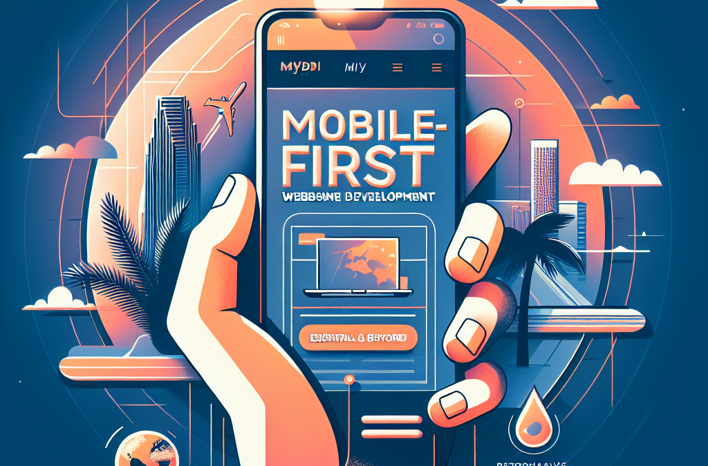
The Rise of Mobile: Why Miami Businesses Must Embrace Mobile-First Website Development
Attention Miami business owners and web developers: the future is mobile. With the rapid rise of smartphone usage and the increasing reliance on mobile devices for online activities, having a mobile-first website is no longer a luxury but a necessity. In this article, we will explore the concept of mobile-first website development and why it is essential for businesses in Miami and beyond.
Gone are the days when a desktop website was enough to attract and engage customers. According to recent statistics, over 50% of website traffic worldwide comes from mobile devices. In Miami, where the tech-savvy population is always on the go, mobile browsing has become the norm. As a result, businesses that fail to optimize their websites for mobile devices risk losing out on a significant chunk of potential customers.
Key Takeaways:
1. Mobile-first website development is crucial in today’s digital landscape, especially for businesses in Miami and beyond. With the majority of internet users accessing websites through mobile devices, it is essential to prioritize mobile optimization to reach and engage a wider audience.
2. A mobile-first approach involves designing and developing websites with mobile devices in mind first, and then adapting them for larger screens. This ensures a seamless user experience across all devices and improves website performance, speed, and search engine rankings.
3. Miami, known for its vibrant tourism and business sectors, can greatly benefit from mobile-first website development. By catering to the needs of mobile users, businesses can enhance their online presence, attract more visitors, and increase conversions.
4. Mobile-first design principles include responsive layouts, touch-friendly navigation, and optimized content. These elements help to create a user-friendly experience, increase user engagement, and drive higher conversion rates.
5. Mobile-first website development is not just a trend; it is a necessity. With the increasing use of smartphones and tablets, businesses that neglect mobile optimization risk losing customers and falling behind their competitors. Embracing a mobile-first strategy is essential for long-term success in the digital age.
Controversial Aspect 1: Exclusion of Non-Mobile Users
One of the main criticisms of mobile-first website development is that it can potentially exclude non-mobile users. While it is true that the majority of internet users now access the web through their mobile devices, there are still a significant number of people who rely on desktop computers or laptops. By prioritizing mobile optimization, websites may neglect these users and provide them with a subpar experience.
Proponents of mobile-first development argue that the majority should be prioritized, as it allows for a better user experience for the vast majority of visitors. They argue that designing for mobile first ensures that websites are streamlined, fast, and easy to navigate on smaller screens, which benefits the majority of users. Additionally, they contend that non-mobile users can still access mobile-optimized websites on their desktops, although the experience may not be as optimal as on a mobile device.
Opponents, on the other hand, argue that by neglecting non-mobile users, websites risk alienating a significant portion of their potential audience. They argue that businesses should cater to all types of users, regardless of their preferred device, to ensure inclusivity and maximize reach. They suggest that a better approach would be to adopt a responsive design, which adapts to different screen sizes and devices, allowing for a seamless experience across platforms.
Controversial Aspect 2: Limited Screen Real Estate
Another controversial aspect of mobile-first website development is the limited screen real estate available on mobile devices. Mobile screens are significantly smaller than desktop screens, which can pose challenges for designers and developers. Critics argue that this constraint can lead to a compromised user experience, as important content and features may be squeezed into a small space, making it harder for users to find what they need.
Advocates of mobile-first development counter this argument by highlighting the benefits of designing for smaller screens. They argue that the constraints of mobile screens force designers to prioritize content and features, resulting in a more focused and streamlined user experience. By eliminating unnecessary clutter and prioritizing key information, mobile-first design can enhance usability and improve conversion rates.
However, opponents argue that while prioritizing content is important, it should not come at the expense of user experience. They contend that mobile-first design can sometimes lead to a lack of discoverability, as important features may be hidden or overlooked due to limited screen space. They suggest that a balanced approach that considers both mobile and desktop users can ensure a better overall user experience.
Controversial Aspect 3: Development Complexity and Cost
Mobile-first website development can also be controversial due to the increased complexity and cost associated with building and maintaining separate mobile and desktop versions of a website. Developing a mobile-first website requires additional time and resources, as designers and developers need to create a separate mobile version that is optimized for smaller screens.
Supporters of mobile-first development argue that the additional investment is worth it, considering the growing number of mobile users and the potential for increased engagement and conversions. They argue that by prioritizing mobile optimization, businesses can stay ahead of the curve and provide a superior user experience, leading to higher customer satisfaction and loyalty.
Opponents, however, raise concerns about the increased development complexity and cost. They argue that maintaining separate mobile and desktop versions of a website can be time-consuming and expensive. They suggest that businesses should consider alternative approaches, such as responsive design, which can adapt to different screen sizes without the need for separate versions.
Mobile-first website development is not without its controversies. While it offers benefits such as improved user experience on mobile devices and better engagement with the majority of internet users, it also raises concerns about exclusion of non-mobile users, limited screen real estate, and increased development complexity and cost. Finding a balance between mobile and desktop optimization is crucial to ensure inclusivity and a seamless user experience across all devices.
The Rise of Mobile-First Website Development
In recent years, the world has witnessed a significant shift in internet usage patterns, with mobile devices becoming the primary means of accessing the web. As a result, businesses and website developers have had to adapt their strategies to cater to this mobile-first audience. This emerging trend has become particularly essential for cities like Miami, known for their tech-savvy population and thriving digital economy. Let’s explore the reasons behind this shift and the potential future implications.
1. Mobile-First Design: Prioritizing User Experience
Mobile-first website development involves designing websites with mobile devices in mind first and then scaling up to larger screens. This approach acknowledges the dominance of mobile usage and prioritizes user experience on these devices. In Miami, where smartphone penetration is high, businesses cannot afford to neglect the mobile user experience. By adopting a mobile-first design strategy, companies can ensure that their websites are optimized for smaller screens, leading to improved engagement and conversion rates.
Furthermore, mobile-first design goes beyond responsive layouts. It involves rethinking the entire user interface, navigation, and content structure to fit the constraints and capabilities of mobile devices. This approach encourages simplicity, speed, and intuitive interactions, which are crucial for engaging the mobile audience.
2. Accelerated Mobile Pages (AMP): Enhancing Performance
As mobile usage continues to surge, website speed has become a critical factor in user satisfaction and search engine rankings. Slow-loading websites can significantly impact bounce rates and conversions. To address this issue, Google introduced Accelerated Mobile Pages (AMP) – an open-source initiative aimed at improving mobile web performance.
AMP allows developers to create stripped-down versions of web pages that load almost instantly on mobile devices. By leveraging AMP, businesses in Miami can deliver lightning-fast experiences to their users, reducing bounce rates and increasing engagement. Additionally, AMP pages are favored by search engines, leading to higher visibility and potential organic traffic growth.
3. Progressive Web Apps (PWAs): Bridging the Gap Between Web and Apps
Progressive Web Apps (PWAs) have gained traction as a hybrid solution between traditional websites and native mobile apps. PWAs combine the best of both worlds, offering the reach and discoverability of websites while providing app-like features and performance.
Miami businesses can leverage PWAs to provide a seamless mobile experience without the need for users to install an app. PWAs can be accessed directly from a browser, eliminating the friction of app downloads and updates. These web apps can also work offline, send push notifications, and utilize device features like cameras and geolocation.
By adopting PWAs, Miami businesses can enhance user engagement, improve conversion rates, and reduce development and maintenance costs associated with building and maintaining native apps for multiple platforms.
The Future of Mobile-First Website Development
As mobile usage continues to dominate, the importance of mobile-first website development will only grow. Here are some potential future implications of this emerging trend:
1. Voice Search Optimization
Voice assistants, such as Siri, Alexa, and Google Assistant, have become increasingly popular, driving the rise of voice search. Miami businesses will need to optimize their websites for voice queries, ensuring that their content is easily discoverable and compatible with voice search algorithms. Mobile-first website development will play a crucial role in adapting to this voice-driven future.
2. Augmented Reality (AR) Integration
As AR technology continues to advance, integrating augmented reality experiences into websites will become more prevalent. Miami businesses can leverage mobile-first development to create immersive AR experiences that engage users and provide unique value. From virtual try-on features for fashion retailers to interactive tours for real estate agencies, AR integration will become a competitive advantage.
3. Mobile Commerce (mCommerce) Dominance
The rise of mobile-first website development aligns with the growing dominance of mobile commerce (mCommerce). Miami businesses will need to prioritize mobile optimization to capture a significant share of the mCommerce market. Seamless mobile checkout experiences, mobile payment integrations, and personalized mobile shopping experiences will be essential for success in this mobile-first economy.
Mobile-first website development has become an essential strategy for businesses in Miami and beyond. By prioritizing mobile user experience, leveraging technologies like AMP and PWAs, and preparing for future trends like voice search and AR integration, companies can stay ahead of the curve and thrive in the mobile-centric digital landscape.
Insight 1: The Mobile-First Approach is Revolutionizing Website Development
The mobile-first approach to website development has emerged as a game-changer in the industry. Traditionally, web design focused on creating websites for desktop users first, with mobile optimization as an afterthought. However, with the explosive growth of smartphone usage, the paradigm has shifted towards prioritizing mobile users.
By adopting a mobile-first approach, developers design websites with the mobile experience as the primary consideration. This means that the website’s layout, content, and functionality are optimized for smaller screens, touch navigation, and slower internet connections. As a result, users accessing the website on their smartphones have a seamless and user-friendly experience.
This shift in mindset has had a profound impact on the industry. Web developers now need to think differently, creating responsive designs that adapt to various screen sizes and resolutions. This approach has not only improved user experience but has also influenced the way websites are built, making them more efficient and future-proof.
Insight 2: Miami, a Mobile-First City
Miami is a city known for its vibrant culture, diverse population, and thriving business community. It is also a city where mobile usage is pervasive. With its large population of tech-savvy residents and visitors, Miami has become a hub for mobile-first website development.
Businesses in Miami understand the importance of catering to the mobile audience. From restaurants and retail stores to real estate agencies and entertainment venues, almost every industry in Miami has recognized the need for mobile-optimized websites. They understand that a significant portion of their target audience accesses their websites through smartphones, and failing to provide a seamless mobile experience can result in missed opportunities and lost customers.
As a result, web development agencies in Miami are at the forefront of mobile-first website development. They have the expertise and experience to create visually appealing and functional websites that perform exceptionally well on mobile devices. The city’s focus on mobile-first development has given rise to a thriving industry, attracting businesses from across the country and beyond seeking to leverage Miami’s expertise.
Insight 3: Mobile-First Development Beyond Miami
While Miami has established itself as a leader in mobile-first website development, the impact of this approach extends far beyond the city’s borders. Businesses and organizations worldwide are recognizing the need to prioritize mobile users and are adopting the mobile-first approach in their web development strategies.
One of the driving forces behind this global shift is the increasing smartphone penetration rate. According to Statista, the number of smartphone users worldwide is projected to reach 3.8 billion by 2021. This staggering figure highlights the immense potential of the mobile market and the need for businesses to adapt to this new reality.
Furthermore, search engine algorithms have also started favoring mobile-friendly websites. Google, for instance, uses mobile-friendliness as a ranking factor, prioritizing websites that provide a seamless mobile experience. This means that businesses that neglect mobile optimization not only risk alienating their mobile audience but also face the possibility of lower search engine visibility and reduced organic traffic.
As a result, businesses and web developers across the globe are embracing mobile-first development. From small startups to multinational corporations, organizations are investing in responsive designs, mobile-friendly content, and optimized user experiences. The mobile-first approach has become an essential part of staying competitive in today’s digital landscape.
The Rise of Mobile Internet Usage
With the rapid advancement of technology, mobile devices have become an integral part of our daily lives. In fact, according to a recent study, mobile internet usage has surpassed desktop usage for the first time in history. This shift in consumer behavior has significant implications for businesses, especially in a tech-savvy city like Miami. To stay ahead of the competition, companies must prioritize mobile-first website development.
Understanding Mobile-First Website Development
Mobile-first website development is a design approach that prioritizes the mobile experience over desktop. Instead of adapting a desktop website for mobile, developers start with the mobile version and then scale up for larger screens. This approach ensures that the website is optimized for mobile users, providing a seamless and intuitive browsing experience.
Responsive Design vs. Mobile-First Design
While responsive design is a popular approach to make websites adaptable to different screen sizes, it is not the same as mobile-first design. Responsive design focuses on adapting a desktop website for mobile, which can result in a less optimized mobile experience. On the other hand, mobile-first design takes into account the unique needs and constraints of mobile users from the outset, leading to a more user-friendly interface.
Benefits of Mobile-First Website Development
There are several benefits to adopting a mobile-first approach to website development. Firstly, it improves user experience by providing a seamless browsing experience across devices. Mobile users are more likely to engage with a website that is optimized for their device, leading to increased conversions and customer satisfaction.
Secondly, mobile-first design can improve search engine rankings. Google has implemented mobile-first indexing, which means that websites optimized for mobile will rank higher in search results. By prioritizing mobile-first development, businesses can improve their visibility and attract more organic traffic.
Finally, a mobile-first approach future-proofs your website. As technology continues to evolve, new devices and screen sizes will emerge. By starting with mobile, you can easily adapt your website to fit these new devices, ensuring that your business stays relevant and accessible to users.
Case Study: Miami-based Business Thrives with Mobile-First Design
One example of a Miami-based business that has successfully embraced mobile-first website development is a local restaurant called “Taste of Miami.” Prior to implementing a mobile-first approach, their website was difficult to navigate on mobile devices, leading to a high bounce rate and a decrease in online reservations.
After redesigning their website with a mobile-first approach, “Taste of Miami” saw a significant improvement in user engagement. The mobile-optimized website provided a seamless browsing experience, resulting in an increase in online reservations and positive customer feedback. By prioritizing mobile-first design, the restaurant was able to stay competitive in Miami’s thriving culinary scene.
Challenges and Considerations for Mobile-First Development
While mobile-first website development offers numerous benefits, it also presents challenges that businesses need to be aware of. One of the main challenges is designing for smaller screens and limited bandwidth. Developers must carefully prioritize content and optimize images and videos to ensure fast loading times and a smooth user experience.
Another consideration is the need for responsive testing across various devices and screen sizes. Mobile-first design requires thorough testing to ensure that the website looks and functions correctly on different devices, including smartphones and tablets. This testing phase is crucial to identify and fix any usability issues.
Miami’s Mobile-First Revolution
Miami is a city known for its vibrant culture and technological advancements. As the demand for mobile internet usage continues to rise, businesses in Miami must adapt to this mobile-first revolution. By investing in mobile-first website development, companies can differentiate themselves from their competitors and cater to the needs of their tech-savvy customers.
Mobile-first website development is no longer an option; it is essential for businesses in Miami and beyond. By prioritizing the mobile experience, companies can improve user engagement, enhance search engine visibility, and future-proof their websites. With the rise of mobile internet usage, businesses that neglect mobile-first design risk losing out on valuable opportunities and falling behind their competitors. Embracing mobile-first website development is a strategic move that will benefit businesses in Miami and beyond in the long run.
The Rise of Mobile Devices
The historical context of mobile-first website development can be traced back to the rise of mobile devices in the early 2000s. With the of smartphones, people started accessing the internet on their mobile devices more frequently. This shift in consumer behavior presented a new challenge for website developers and designers.
Initially, websites were designed for desktop computers, with little consideration for mobile compatibility. As a result, mobile users often faced difficulties in accessing and navigating websites on their devices. This led to the need for a new approach to website development that prioritized mobile users.
The Emergence of Responsive Web Design
In response to the growing demand for mobile-friendly websites, the concept of responsive web design emerged. This approach aimed to create websites that could adapt and respond to different screen sizes and resolutions, providing an optimal viewing experience for users across various devices.
Responsive web design allowed developers to create websites that could automatically adjust their layout, font sizes, and images based on the device being used. This approach significantly improved the user experience for mobile users, as websites became more accessible and easier to navigate on smaller screens.
The Importance of Mobile-First Design
While responsive web design addressed the issue of mobile compatibility, it still primarily focused on designing for desktop users and then adapting the layout for mobile devices. However, as mobile usage continued to grow, it became evident that a new approach was needed.
Mobile-first design emerged as a response to the increasing dominance of mobile devices in internet usage. This approach advocated for designing websites specifically for mobile devices first, and then progressively enhancing the design for larger screens.
The shift to mobile-first design was driven by several factors. Firstly, mobile devices became the primary means of accessing the internet for many users. Secondly, mobile devices have unique features and constraints, such as smaller screens and touch-based navigation, which required tailored design considerations.
The Impact on User Experience
Mobile-first design had a significant impact on user experience. By prioritizing mobile users, websites became more streamlined, with simplified navigation and faster loading times. This improved user experience led to higher engagement and increased conversions for businesses.
Moreover, mobile-first design forced developers to focus on essential content and prioritize information hierarchy. This resulted in cleaner and more concise websites that were easier to navigate and understand, benefiting both mobile and desktop users.
The Evolution of Mobile-First Development
Since its inception, mobile-first development has continued to evolve alongside advancements in technology and changes in user behavior. As mobile devices became more powerful and capable, developers were able to incorporate more complex features and functionalities into mobile-first websites.
Additionally, the of mobile app development frameworks, such as React Native and Flutter, further expanded the possibilities of mobile-first development. These frameworks allowed developers to build native-like mobile experiences using web technologies, blurring the line between traditional websites and mobile apps.
Furthermore, the rise of mobile commerce and the increasing demand for seamless mobile transactions have pushed mobile-first development to prioritize e-commerce capabilities. This includes features like mobile payment integration, optimized product browsing, and simplified checkout processes.
The Current State and Future Outlook
Today, mobile-first development has become the standard approach for website design and development. With mobile usage surpassing desktop usage, businesses and developers understand the importance of providing a seamless mobile experience.
Looking ahead, the future of mobile-first development will likely be shaped by emerging technologies such as 5G, augmented reality (AR), and virtual reality (VR). These technologies have the potential to revolutionize the way we interact with websites and further enhance the mobile user experience.
The historical context of mobile-first website development can be traced back to the rise of mobile devices and the need to cater to mobile users. It has evolved from responsive web design to a more focused approach that prioritizes mobile users from the start. The impact on user experience has been significant, leading to streamlined websites and higher engagement. Mobile-first development continues to evolve, incorporating advanced features and functionalities, and its future looks promising with the emergence of new technologies.
FAQs
1. What is mobile-first website development?
Mobile-first website development is an approach where websites are designed and developed primarily for mobile devices, such as smartphones and tablets, before being adapted for larger screens like desktop computers. This approach ensures that the website is optimized for mobile users, who now make up the majority of internet users.
2. Why is mobile-first website development important?
Mobile-first website development is important because mobile usage has surpassed desktop usage in recent years. It is crucial for businesses to provide a seamless and user-friendly experience to their mobile users. By prioritizing mobile design and functionality, businesses can reach a wider audience, improve user engagement, and ultimately increase conversions and sales.
3. How does mobile-first website development benefit businesses in Miami?
Miami has a large population of tech-savvy individuals who heavily rely on mobile devices for their online activities. By adopting mobile-first website development, businesses in Miami can cater to the preferences and needs of their target audience, enhancing their online presence and competitiveness in the local market.
4. Will a mobile-first website work well on desktop computers?
Yes, a mobile-first website will work well on desktop computers. While the initial design and development focus is on mobile devices, a mobile-first approach ensures that the website is responsive and adaptable to different screen sizes and resolutions. This means that the website will still provide a seamless user experience on desktop computers, with all the essential features and functionalities intact.
5. How does mobile-first website development affect search engine rankings?
Mobile-first website development can positively impact search engine rankings. Search engines, like Google, prioritize mobile-friendly websites in their search results, especially for mobile searches. By having a mobile-first website, businesses can improve their chances of ranking higher in search engine results pages (SERPs), leading to increased visibility and organic traffic.
6. Does mobile-first website development require a separate website or domain?
No, mobile-first website development does not require a separate website or domain. With responsive design techniques, a single website can adapt to different screen sizes and devices. This approach ensures that businesses do not have to manage multiple websites, reducing maintenance efforts and costs.
7. What are the key elements of a mobile-first website?
The key elements of a mobile-first website include:
- Responsive design: Ensuring the website adapts to different screen sizes
- Mobile-friendly navigation: Simplified menus and intuitive navigation
- Fast loading times: Optimized images and code to minimize loading times
- Touch-friendly buttons and forms: Easy-to-use interface for touchscreens
- Readable content: Clear and legible text that doesn’t require zooming
8. How can businesses in Miami implement mobile-first website development?
Businesses in Miami can implement mobile-first website development by following these steps:
- Conduct research on target audience preferences and behavior
- Create a mobile-friendly design and user interface
- Optimize website performance for mobile devices
- Test the website across different mobile devices and browsers
- Monitor and analyze user feedback and behavior
- Continuously improve and update the website based on user insights
9. Are there any drawbacks to mobile-first website development?
While mobile-first website development has numerous benefits, there are a few drawbacks to consider. One potential drawback is the additional time and resources required for initial design and development. Furthermore, certain complex functionalities or design elements may need to be simplified or adapted for mobile devices, which could affect the overall user experience. However, these drawbacks can be mitigated with proper planning and execution.
10. Can businesses with existing websites switch to a mobile-first approach?
Yes, businesses with existing websites can switch to a mobile-first approach. It may require redesigning and restructuring the website to prioritize mobile users. By working with experienced web developers and designers, businesses can successfully transition to a mobile-first approach without losing their existing content and functionalities.
Concept 1: Mobile-First Website Development
Mobile-First Website Development is a concept that focuses on designing and building websites specifically for mobile devices like smartphones and tablets. In the past, websites were primarily created for desktop computers, and then adapted to fit smaller screens. However, with the increasing popularity and usage of mobile devices, it has become crucial to prioritize mobile users when developing websites.
When following the Mobile-First approach, designers and developers start by designing the website for mobile devices first, and then adapt it for larger screens like desktops. This ensures that the website is optimized for mobile users, providing them with a seamless and user-friendly experience.
Mobile-First Website Development involves various techniques and considerations. One important aspect is responsive design, which means that the website layout and content automatically adjust to fit different screen sizes. This eliminates the need for users to zoom in or scroll horizontally, making the website easier to navigate on mobile devices.
Another important consideration is the loading speed of the website. Mobile users often have slower internet connections compared to desktop users, so it is crucial to optimize the website for faster loading times. This can be achieved by minimizing file sizes, compressing images, and using efficient coding practices.
Overall, Mobile-First Website Development is all about prioritizing the mobile user experience and ensuring that websites are accessible and functional on a variety of devices.
Concept 2: Importance for Miami
Miami, being a vibrant and bustling city, has a high mobile device usage rate. People in Miami heavily rely on their smartphones for various activities, including browsing the internet, shopping, and accessing local services. Therefore, it is crucial for businesses and organizations in Miami to adopt Mobile-First Website Development to cater to the needs of their target audience.
By implementing Mobile-First strategies, businesses in Miami can provide a seamless and optimized experience to their mobile users. This can lead to increased customer satisfaction, higher engagement, and ultimately, improved business outcomes. A mobile-friendly website can also help businesses stay competitive in the digital landscape, as customers are more likely to choose a company that offers a user-friendly mobile experience.
Furthermore, Mobile-First Website Development can also have a positive impact on search engine rankings. Search engines like Google prioritize mobile-friendly websites in their search results, meaning that businesses with mobile-optimized websites are more likely to appear higher in search rankings. This can result in increased visibility and organic traffic for businesses in Miami.
In summary, Mobile-First Website Development is essential for businesses and organizations in Miami to cater to the high mobile device usage in the city, enhance user experience, and improve their online presence.
Concept 3: Beyond Miami – Global Significance
While Mobile-First Website Development is crucial for Miami, its significance goes beyond just one city. Mobile usage has been steadily increasing worldwide, with more people accessing the internet through mobile devices than desktop computers. This global trend makes Mobile-First Website Development essential for businesses and organizations around the world.
By adopting a Mobile-First approach, businesses can reach a larger audience and tap into the growing mobile market. With the majority of internet users accessing websites through their smartphones, it is essential to provide a seamless and optimized mobile experience to attract and retain customers.
Furthermore, Mobile-First Website Development aligns with the principles of accessibility and inclusivity. Many individuals, especially in developing countries, may not have access to desktop computers but rely solely on mobile devices for internet access. By prioritizing mobile users, businesses can ensure that their websites are accessible to a wider range of people, regardless of their device limitations.
Moreover, as technology continues to evolve, new devices and form factors are emerging, such as smartwatches and virtual reality headsets. By adopting a Mobile-First approach, businesses can future-proof their websites and ensure compatibility with upcoming devices, providing a seamless experience across various platforms.
Mobile-First Website Development is not only essential for Miami but also holds global significance. By prioritizing mobile users, businesses and organizations can enhance user experience, increase their online visibility, and adapt to the evolving digital landscape.
Common Misconception 1: Mobile-first website development is only necessary for Miami businesses
One common misconception about mobile-first website development is that it is only necessary for businesses in Miami or other major cities. However, this is far from the truth. In today’s digital age, where mobile devices have become the primary means of accessing the internet, having a mobile-first website is essential for businesses regardless of their location.
According to Statista, as of 2021, there are approximately 3.8 billion smartphone users worldwide. This number is expected to grow to 3.8 billion by 2023. In the United States alone, about 81% of adults own a smartphone. These statistics clearly demonstrate the widespread use of mobile devices for internet browsing.
Furthermore, Google, the world’s most popular search engine, has prioritized mobile-first indexing since 2019. This means that Google primarily uses the mobile version of a website’s content to index and rank pages in search results. Websites that are not mobile-friendly may experience a significant drop in visibility and organic traffic.
Therefore, it is crucial for businesses to adopt a mobile-first approach to website development, regardless of their location. By doing so, they can ensure a seamless user experience for their mobile visitors and maintain their online visibility.
Common Misconception 2: Mobile-first website development is only relevant for e-commerce businesses
Another common misconception is that mobile-first website development is only relevant for e-commerce businesses. While it is true that e-commerce businesses heavily rely on mobile traffic for sales, mobile-first design principles are equally important for all types of businesses.
Consider a local restaurant in Miami that wants to attract customers by showcasing its menu, location, and contact information on its website. A mobile-first design approach would ensure that potential customers can easily access this information on their smartphones, regardless of their location or the device they are using.
Similarly, service-based businesses such as law firms, healthcare providers, or real estate agencies can benefit greatly from mobile-first website development. Potential clients often search for these services on their mobile devices, and a mobile-friendly website can help businesses capture and convert these leads.
Moreover, even informational websites, blogs, and news outlets can benefit from mobile-first design. People increasingly consume news and information on their smartphones, and a website that is optimized for mobile devices will provide a better user experience, leading to increased engagement and return visits.
In summary, mobile-first website development is relevant for all types of businesses, not just e-commerce. Regardless of the industry, a mobile-friendly website is crucial for reaching and engaging with the growing number of mobile internet users.
Common Misconception 3: Mobile-first website development is too expensive and time-consuming
One of the most prevalent misconceptions about mobile-first website development is that it is too expensive and time-consuming. While it is true that building a mobile-first website requires careful planning and development, the long-term benefits outweigh the initial investment.
Firstly, a mobile-first website eliminates the need for separate desktop and mobile versions, reducing the overall development and maintenance costs. With a responsive design approach, the website automatically adjusts its layout and content to fit different screen sizes, eliminating the need for extensive coding and design work.
Additionally, a mobile-first website improves the overall user experience, leading to higher conversion rates and increased customer satisfaction. According to Google, 53% of mobile users abandon a website if it takes more than three seconds to load. By optimizing the website for mobile devices, businesses can improve page load speed and reduce bounce rates.
Furthermore, a mobile-first approach aligns with modern SEO practices and can improve a website’s search engine rankings. As mentioned earlier, Google prioritizes mobile-friendly websites in its search results. By investing in mobile-first website development, businesses can improve their online visibility and attract more organic traffic.
Lastly, it is important to note that mobile-first website development is not a one-time expense. As technology and user behavior evolve, websites need to be regularly updated and optimized. By adopting a mobile-first approach, businesses are future-proofing their websites and ensuring they remain relevant and effective in the long run.
While mobile-first website development may require an initial investment of time and resources, the benefits it brings in terms of user experience, SEO, and cost-efficiency make it a worthwhile endeavor for businesses of all sizes.
Conclusion
Mobile-first website development is no longer just an option, but a necessity for businesses in Miami and beyond. With the increasing usage of smartphones and tablets, having a website that is optimized for mobile devices is crucial for reaching a wider audience and staying competitive in today’s digital landscape.
Throughout this article, we have explored the key benefits and insights of mobile-first website development. We have seen how it improves user experience, increases website traffic, and boosts search engine rankings. Additionally, we have discussed the importance of responsive design and the need for businesses to adapt to the changing habits and preferences of consumers.
As Miami continues to be a hub for tourism, commerce, and innovation, businesses in the city must recognize the significance of mobile-first website development. By prioritizing mobile optimization, companies can effectively engage with their target audience, drive conversions, and ultimately, grow their business. However, this trend is not limited to Miami alone. With the global shift towards mobile usage, businesses worldwide must embrace mobile-first website development to stay relevant and thrive in the digital age.