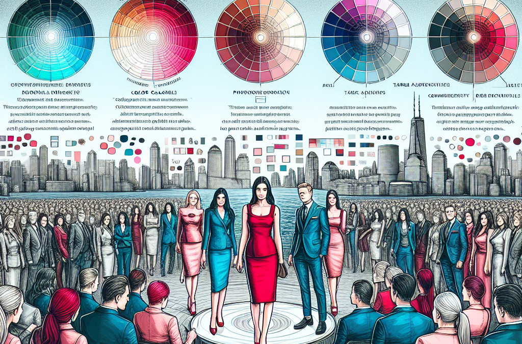
The Power of Perception: How Color Psychology Influences Consumer Behavior and Brand Perception
When it comes to branding, the power of color cannot be underestimated. From the golden arches of McDonald’s to the iconic red and white of Coca-Cola, colors play a crucial role in shaping our perception of a brand. But have you ever wondered why certain colors evoke specific emotions and associations? In this article, we delve into the fascinating world of color psychology and explore how different hues can impact consumer behavior and brand perception.
From the vibrant reds that stimulate appetite to the calming blues that promote trust, understanding the psychology behind color can help businesses make informed decisions when it comes to branding. We will explore the meaning and symbolism behind various colors and discuss how they can be strategically used to target specific demographics. Whether you’re a startup looking to establish your brand identity or an established company seeking to rebrand, understanding the psychology of color can be a powerful tool in capturing the attention and loyalty of your target audience.
Key Takeaways:
1. Color plays a crucial role in branding as it has the power to evoke emotions and influence consumer behavior. Understanding the psychology of color can help businesses choose the right palette that resonates with their target audience.
2. Different colors have different psychological associations. For example, warm colors like red and orange can create a sense of urgency and excitement, while cool colors like blue and green can evoke feelings of calmness and trust. It is important to consider the desired emotional response when selecting colors for a brand.
3. Cultural and personal experiences can also influence the interpretation of colors. It is essential to consider the cultural context and preferences of the target audience to ensure that the chosen colors are well-received and aligned with their values.
4. Color combinations and contrasts can impact brand perception. Complementary colors can create a harmonious and balanced look, while contrasting colors can grab attention and create a bold statement. Finding the right balance and harmony is crucial in creating a visually appealing and impactful brand identity.
5. Testing and feedback are essential in the color selection process. Conducting surveys and gathering feedback from the target audience can provide valuable insights into their color preferences and associations. This data-driven approach can help refine the brand’s color palette and enhance its effectiveness in connecting with the target audience.
The Power of Emotional Connection: Using Color Psychology to Evoke Specific Feelings
Color psychology has long been recognized as a powerful tool in branding, as different colors can evoke specific emotions and feelings in consumers. However, an emerging trend in the psychology of color in branding is the focus on creating a deeper emotional connection with the target audience.
Brands are now investing more time and effort into understanding the emotional needs and desires of their consumers and using color to tap into those emotions. For example, a brand targeting a younger audience might use vibrant and energetic colors to evoke feelings of excitement and enthusiasm. On the other hand, a brand targeting a more mature audience might opt for calming and soothing colors to create a sense of relaxation and trust.
This trend is not only about choosing the right colors but also about how they are used in combination. Brands are experimenting with color palettes that combine contrasting or complementary colors to create a visually striking and emotionally impactful brand identity.
By understanding the psychology of color and using it strategically, brands can create a strong emotional connection with their target audience, leading to increased brand loyalty and engagement.
Personalization and Individuality: Tailoring Color Palettes to Niche Audiences
Gone are the days when brands would choose a generic color palette that aimed to appeal to a broad audience. In today’s competitive market, brands are realizing the importance of personalization and tailoring their color palettes to niche audiences.
With advancements in technology and data analytics, brands now have access to valuable insights about their target audience’s preferences and personalities. This information allows brands to create color palettes that resonate with specific niche markets.
For example, a brand targeting eco-conscious consumers might opt for earthy tones and shades of green to convey a sense of sustainability and environmental responsibility. On the other hand, a brand targeting luxury consumers might choose a palette of rich, deep colors to evoke feelings of opulence and exclusivity.
This trend of personalized color palettes not only helps brands stand out in a crowded market but also allows them to connect with their target audience on a deeper level. By understanding the unique preferences and values of their niche market, brands can create a sense of belonging and exclusivity, leading to increased brand loyalty and advocacy.
The Rise of Minimalism: Simplifying Color Palettes for a Clean and Modern Look
In recent years, there has been a growing trend towards minimalism in branding, with many brands opting for clean and simple designs. This trend is now extending to color palettes, with brands embracing a more restrained and simplified approach.
Gone are the days of vibrant and busy color schemes. Instead, brands are choosing to use a limited number of colors, often in neutral or muted tones, to create a clean and modern look.
This minimalist approach not only helps brands stand out in a cluttered visual landscape but also conveys a sense of sophistication and elegance. By using a simplified color palette, brands can create a cohesive and harmonious visual identity that is visually appealing and easy for consumers to remember.
Furthermore, a minimalist color palette allows brands to focus on other elements of their branding, such as typography and imagery, without overwhelming the visual experience. This trend is particularly popular among tech companies and lifestyle brands that want to convey a sense of modernity and simplicity.
As the world becomes increasingly saturated with visual stimuli, the rise of minimalism in color palettes is likely to continue. Brands that embrace this trend can create a strong and memorable brand identity that resonates with consumers in a cluttered marketplace.
The Controversy of Color Psychology
Color psychology is a fascinating field that explores the impact of colors on human emotions and behavior. In the realm of branding, understanding the psychology of color can be a powerful tool for marketers. However, there are several controversial aspects surrounding the use of color in branding that are worth examining.
1. Cultural Differences in Color Perception
One of the most significant controversies in color psychology is the extent to which color preferences and associations are universal or culturally specific. While some studies suggest that certain colors elicit similar emotional responses across cultures, others argue that cultural factors heavily influence color perception.
For example, the color red is often associated with danger and caution in Western cultures, while it symbolizes good luck and prosperity in many Asian cultures. This cultural variation can pose challenges for global brands trying to create a consistent brand image across different markets.
Furthermore, even within a single culture, individual experiences and personal preferences can shape color associations. This means that while color psychology can provide general insights, it may not always be accurate in predicting how a specific target audience will respond to a particular color.
2. Overgeneralization and Stereotyping
Another controversial aspect of using color psychology in branding is the risk of overgeneralization and stereotyping. Color associations can be powerful, but they should not be used as a one-size-fits-all approach to branding.
For instance, the color pink is often associated with femininity and is commonly used in branding targeted at women. While this may be effective for certain products or services, it can reinforce gender stereotypes and exclude potential customers who do not identify with traditional gender norms.
Similarly, associating specific colors with certain characteristics or emotions can oversimplify human experiences and create unrealistic expectations. People are complex, and their responses to colors are influenced by a multitude of factors beyond simple color associations.
3. Ethical Considerations in Manipulating Consumer Behavior
Color psychology can be a powerful tool for influencing consumer behavior. Marketers can strategically use colors to create desired emotional responses and drive sales. However, this raises ethical concerns about the manipulation of consumer behavior.
Some argue that using color psychology to manipulate consumers is a form of psychological manipulation and can be seen as unethical. Critics argue that consumers should have the freedom to make informed choices based on rational decision-making rather than being influenced by subconscious responses to colors.
Additionally, the use of color psychology in advertising and branding can exploit vulnerabilities and perpetuate consumerism. By capitalizing on emotional triggers, marketers may encourage impulsive buying behaviors and contribute to excessive consumption.
The controversy surrounding the use of color psychology in branding highlights the need for caution and critical thinking. While color can undoubtedly influence human emotions and behavior, it is essential to consider cultural differences, avoid overgeneralization and stereotyping, and address ethical concerns. Understanding the psychology of color can be a valuable tool for marketers, but it should be used responsibly and ethically to create meaningful connections with consumers.
The Impact of Color on Brand Perception
Color plays a crucial role in shaping the perception of a brand. It has the power to evoke emotions, convey meaning, and influence consumer behavior. When choosing a color palette for your brand, it is essential to understand the psychological associations that different colors have. For example, warm colors like red and orange can create a sense of urgency and excitement, while cool colors like blue and green can evoke feelings of calmness and trust. By aligning your brand’s colors with the desired emotional response, you can effectively communicate your brand’s values and personality to your target audience.
One example of a brand that has successfully utilized color psychology is Coca-Cola. The brand’s signature red color is associated with energy, passion, and excitement. By incorporating this vibrant hue into their logo and packaging, Coca-Cola has created a strong emotional connection with consumers, making their brand instantly recognizable and memorable.
Understanding Cultural and Regional Influences
While color psychology provides valuable insights into the general associations people have with different colors, it is important to consider cultural and regional influences when choosing a color palette for your brand. Colors can have different meanings and symbolism in different cultures, and what may be perceived as positive in one culture could be seen as negative in another.
For instance, the color white is often associated with purity and innocence in Western cultures, but in some Asian cultures, it is associated with mourning and death. Therefore, if you are targeting a global audience, it is crucial to research and understand the cultural connotations of colors in your target markets to avoid any unintended negative associations.
Creating Brand Differentiation Through Color
In today’s competitive marketplace, it is essential for brands to stand out from the crowd and create a unique identity. Color can play a significant role in achieving brand differentiation. By selecting a color palette that is distinct from your competitors, you can create a visual identity that sets your brand apart.
Take, for example, the tech giant Apple. In an industry dominated by blues and blacks, Apple chose to use a sleek and minimalist silver color for their products. This unique color choice not only sets them apart from their competitors but also reflects their brand’s values of simplicity, elegance, and innovation.
The Role of Color in Brand Trust and Credibility
Color can also influence the perceived trustworthiness and credibility of a brand. Certain colors, such as blue and green, are commonly associated with trust, reliability, and stability. These colors are often used by financial institutions, healthcare providers, and other industries where trust is of utmost importance.
For instance, PayPal, a leading online payment platform, utilizes the color blue in its logo and branding. This choice aligns with the brand’s objective of instilling trust and security in its users. By leveraging the psychological associations of the color blue, PayPal effectively communicates its commitment to protecting its customers’ financial information and transactions.
Using Color to Appeal to Specific Target Audiences
When choosing a color palette for your brand, it is crucial to consider your target audience. Different demographics and psychographics may have varying preferences and responses to colors. Understanding your target audience’s preferences and designing your brand’s visual identity accordingly can help you create a stronger connection with your customers.
For example, if your target audience consists primarily of young children, using bright and vibrant colors like yellow and orange can capture their attention and create a sense of excitement. On the other hand, if your target audience is more mature and sophisticated, using muted and elegant colors like navy blue and burgundy can convey a sense of sophistication and professionalism.
Case Study: The Impact of Color in Fast Food Branding
Fast food chains often rely on color psychology to attract customers and influence their purchasing decisions. One notable example is the fast-food giant McDonald’s, which uses the color combination of red and yellow in its branding. Red is known to stimulate appetite and create a sense of urgency, while yellow is associated with happiness and positivity.
By incorporating these colors into their logo, packaging, and restaurant interiors, McDonald’s creates a visually stimulating environment that appeals to their target audience, especially children and young adults. This strategic use of color has contributed to McDonald’s success as one of the most recognizable and profitable fast-food brands worldwide.
Testing and Adapting Your Color Palette
Choosing the right color palette for your brand is not a one-time decision. It is essential to continuously test and adapt your colors based on consumer feedback and market trends. Conducting surveys, focus groups, and A/B testing can provide valuable insights into how your target audience perceives your brand’s colors and whether they align with your intended message.
For instance, in 2010, PepsiCo underwent a major rebranding effort and changed its logo and packaging colors from a predominantly blue color scheme to a combination of red, white, and blue. However, the new color palette received mixed reviews from consumers, with some perceiving it as too similar to their main competitor, Coca-Cola. As a result, PepsiCo had to adapt and refine their color palette to find the right balance between differentiation and consumer preference.
The Power of Color Consistency
Consistency is key when it comes to using color in branding. Once you have chosen a color palette for your brand, it is important to maintain consistency across all touchpoints, including your logo, website, packaging, and marketing materials. Consistent use of colors helps build brand recognition and reinforces the associations consumers have with your brand.
For example, the luxury fashion brand Tiffany & Co. is known for its iconic Tiffany Blue color. This distinctive shade of blue is consistently used in their branding, from their signature boxes to their website design. This color consistency has become synonymous with the brand’s elegance, sophistication, and luxury, making it instantly recognizable and highly coveted by consumers.
Case Study 1: Coca-Cola’s Effective Use of Red
One of the most iconic examples of color psychology in branding is Coca-Cola’s use of the color red. The company has successfully associated the color with its brand and created a strong emotional connection with its target audience.
Coca-Cola’s choice of red is not arbitrary; it is strategically chosen to evoke feelings of excitement, energy, and passion. Red is a highly stimulating color that grabs attention and stimulates appetite, making it a perfect choice for a beverage company.
The success of Coca-Cola’s branding can be seen in its consistent use of red across all its marketing materials, including its logo, packaging, and advertisements. The color has become synonymous with the brand, and consumers instantly recognize it as a symbol of refreshment and enjoyment.
By understanding the psychology of color and choosing red as its primary color, Coca-Cola has created a powerful brand identity that resonates with its target audience and has stood the test of time.
Case Study 2: Apple’s Use of Minimalism and White
Apple is known for its sleek and minimalist designs, and its use of the color white plays a crucial role in its branding strategy. The company’s choice of white creates a sense of simplicity, elegance, and sophistication, aligning with its brand values of innovation and user-friendly technology.
Apple’s use of white is evident in its product designs, packaging, and advertising campaigns. The clean and uncluttered aesthetic communicates a sense of purity and modernity, appealing to its target audience of tech-savvy individuals who value simplicity and minimalism.
The psychology behind the color white is also significant. It is associated with feelings of cleanliness, purity, and clarity, which are all desirable qualities when it comes to technology products. Additionally, white creates a sense of space and openness, making Apple’s products feel more approachable and user-friendly.
Apple’s successful use of white in its branding has helped it establish itself as a leader in the technology industry and has contributed to its loyal customer base.
Case Study 3: McDonald’s Use of Yellow and Red
McDonald’s is another brand that has effectively utilized the psychology of color in its branding strategy. The fast-food giant’s use of yellow and red is a prime example of how color can influence consumer behavior and create a recognizable brand identity.
The combination of yellow and red in McDonald’s branding is not accidental. Yellow is associated with happiness, optimism, and warmth, while red evokes feelings of excitement, energy, and appetite. Together, these colors create a sense of fun, friendliness, and fast service, aligning perfectly with McDonald’s brand image.
McDonald’s has incorporated the yellow and red color scheme in its logo, restaurant interiors, packaging, and advertising materials. The vibrant colors stand out and attract attention, making the brand easily recognizable and memorable.
Moreover, the psychology of color extends beyond visual appeal. Studies have shown that the combination of yellow and red can actually stimulate appetite and increase hunger, making McDonald’s a go-to choice for many consumers.
By understanding the psychology of color and strategically choosing yellow and red, McDonald’s has created a strong brand identity that appeals to its target audience and has contributed to its global success.
The Impact of Color on Branding
Color plays a significant role in branding as it can evoke emotions, convey messages, and influence consumer behavior. When choosing the right color palette for a brand, it is crucial to consider the target audience and the psychological effects that different colors can have on them.
Color Associations and Meanings
Colors have inherent associations and meanings that can vary across cultures and individuals. Understanding these associations is essential in selecting colors that align with the brand’s message and values.
For example, red is often associated with passion, energy, and excitement. It can create a sense of urgency and stimulate appetite, making it a popular choice for food and beverage brands. On the other hand, blue is commonly associated with trust, reliability, and calmness, making it suitable for financial institutions and healthcare organizations.
Color Preferences by Gender
Research has shown that there are differences in color preferences between genders. While these preferences are not absolute, they can provide valuable insights when targeting specific demographics.
Studies have found that women tend to prefer softer colors such as pastels, while men lean towards bold and vibrant colors. This information can help guide color choices when targeting a predominantly male or female audience.
Cultural Considerations
Cultural factors heavily influence color perception and meaning. Colors can have different connotations and symbolism in various cultures, and it is crucial to consider these nuances when branding internationally or targeting specific ethnic groups.
For example, in Western cultures, white is often associated with purity and weddings, while in many Eastern cultures, white is associated with mourning and funerals. Similarly, the color red may symbolize luck and prosperity in Chinese culture, but it can represent danger or warning in other contexts.
Contrast and Readability
When selecting a color palette for branding, it is important to consider contrast and readability. Colors that have low contrast can make it difficult for the audience to read or understand the brand’s message.
For instance, using light-colored text on a white background may result in poor legibility, leading to a negative user experience. High contrast between text and background colors ensures readability and accessibility for all users, including those with visual impairments.
Color Combinations and Harmonies
Choosing the right color combinations and harmonies is crucial in creating a visually appealing and cohesive brand identity. Different color schemes can evoke different emotions and create distinct brand personalities.
There are several popular color schemes, including complementary, analogous, monochromatic, and triadic. Complementary colors, which are opposite each other on the color wheel, create a vibrant and energetic feel. Analogous colors, which are adjacent to each other, create a harmonious and soothing effect. Monochromatic colors, derived from a single hue, create a sense of simplicity and elegance. Triadic colors, evenly spaced on the color wheel, offer a balanced and dynamic look.
Color Psychology in Marketing
Understanding the psychology of color can be a powerful tool in marketing and advertising. Different colors can elicit specific emotions and influence consumer behavior.
For example, warm colors like red and orange can create a sense of urgency and stimulate impulse buying. Cool colors like blue and green can promote a feeling of calmness and trust, making them suitable for brands that want to establish a sense of reliability.
Color psychology can also be used strategically to differentiate a brand from its competitors. By selecting a unique color palette that stands out in the industry, a brand can create a memorable and distinctive identity.
Testing and Iteration
While understanding the psychological impact of colors is important, it is equally essential to test and iterate on the chosen color palette. Conducting user research, surveys, and A/B testing can provide valuable insights into how the target audience perceives and responds to different color choices.
By continuously evaluating and refining the color palette based on user feedback, a brand can ensure that its colors effectively communicate the desired message and resonate with the target audience.
Choosing the right color palette for branding involves a deep understanding of color associations, cultural considerations, and psychological effects. By carefully selecting and testing colors, a brand can create a visually appealing and impactful identity that resonates with its target audience.
The Historical Context of ‘The Psychology of Color in Branding’
In the world of marketing and branding, understanding the psychology of color has been a crucial aspect of creating successful campaigns for decades. The use of color to evoke emotions, convey messages, and influence consumer behavior has evolved over time, reflecting changes in societal norms, cultural preferences, and technological advancements.
The Early Beginnings
The exploration of color psychology in branding can be traced back to the early 20th century when advertisers and marketers began to recognize the power of visual stimuli in influencing consumer perceptions. During this time, color choices in branding were often based on personal preferences or subjective opinions rather than scientific research.
However, in the 1920s, Swiss psychologist Carl Jung introduced the concept of archetypes, which suggested that certain colors could evoke specific emotional responses. This idea laid the foundation for further exploration into the psychology of color.
The Influence of Cultural and Societal Shifts
As the world underwent significant cultural and societal shifts, so did the use of color in branding. In the 1950s and 1960s, the rise of consumer culture and mass media led to a more strategic approach to color selection. Advertisers began to study the impact of color on consumer behavior and tailor their branding strategies accordingly.
During this period, bright and vibrant colors were often used to convey optimism, energy, and youthfulness. Brands like Coca-Cola and McDonald’s embraced red and yellow, which became synonymous with their respective identities. These color choices aimed to attract attention, create a sense of excitement, and evoke positive emotions.
However, the 1970s and 1980s witnessed a shift towards more muted and earthy tones. This change reflected a growing environmental consciousness and a desire for authenticity. Brands like The Body Shop and Starbucks embraced green, symbolizing their commitment to sustainability and natural products.
The Rise of Color Psychology as a Science
In the late 20th century, color psychology began to gain recognition as a legitimate field of study. Researchers conducted numerous studies to understand the impact of color on human emotions, behavior, and decision-making processes.
One of the most influential studies in this field was conducted by psychologist Andrew Elliot and his colleagues in 2007. The study, titled “Color and Psychological Functioning: The Effect of Red on Performance Attainment,” found that exposure to the color red enhanced performance in tasks requiring attention to detail and accuracy.
These scientific findings paved the way for a more data-driven approach to color selection in branding. Marketers and designers started to rely on empirical evidence to guide their color choices, ensuring that they aligned with the desired emotional response and message they wanted to convey.
The Digital Era and Color Perception
The advent of the internet and digital media brought new challenges and opportunities for color psychology in branding. With the proliferation of screens and devices, color perception became more complex. The same color could appear differently on various screens, leading to inconsistencies in brand representation.
Additionally, the rise of social media platforms allowed consumers to engage with brands on a more personal level. This shift prompted marketers to consider the cultural and emotional associations different demographics had with specific colors.
The Current State of Color Psychology in Branding
Today, color psychology in branding continues to evolve, influenced by technological advancements, changing cultural norms, and consumer expectations. Brands are now more aware of the importance of inclusive design, considering how different colors may be perceived by individuals with color blindness or visual impairments.
Moreover, brands are increasingly tailoring their color choices to specific target audiences. For example, companies targeting younger demographics often use bold and vibrant colors to capture attention and convey a sense of modernity and innovation. In contrast, brands targeting a more mature audience may opt for more subdued and sophisticated color palettes.
The historical context of the psychology of color in branding reveals how this field has evolved from subjective opinions to a more scientific and data-driven approach. As consumer preferences and societal norms change, so too does the understanding of how color influences emotions, behavior, and brand perception. By staying attuned to these shifts, marketers can harness the power of color to create impactful and resonant branding experiences.
FAQs
1. Why is color important in branding?
Color plays a crucial role in branding as it has the power to evoke emotions, influence perceptions, and shape consumer behavior. It helps create a memorable and recognizable brand identity, making it easier for customers to identify and connect with a brand.
2. How does color impact consumer perception?
Colors have psychological associations that can influence how consumers perceive a brand. For example, warm colors like red and orange can create a sense of excitement and urgency, while cool colors like blue and green can evoke feelings of calmness and trust. It’s important to understand your target audience and their cultural backgrounds to choose colors that resonate with them.
3. Can color influence purchasing decisions?
Yes, color can influence purchasing decisions. Studies have shown that 90% of snap judgments made about products can be based on color alone. Different colors can evoke different emotions and create different perceptions of a brand, which can ultimately impact a consumer’s decision to purchase.
4. How do I choose the right color palette for my target audience?
Choosing the right color palette for your target audience requires careful consideration. Start by understanding your brand’s personality and values, as well as the emotions and associations you want to evoke. Then, research your target audience and their cultural preferences to ensure your color choices align with their expectations and preferences.
5. Are there any universal color meanings?
While color meanings can vary across cultures, there are some universal associations that can guide your color choices. For example, red is often associated with passion and energy, while blue is associated with trust and reliability. However, it’s important to consider cultural nuances and conduct thorough research to ensure your color choices are appropriate for your target audience.
6. Can color influence brand recognition?
Yes, color can significantly influence brand recognition. Consistently using specific colors in your branding can help create strong associations between those colors and your brand, making it easier for consumers to recognize and remember your brand in the future.
7. Should I consider my competitors’ color choices?
While it’s important to stand out from your competitors, it’s also crucial to understand the industry norms and expectations. Consider your competitors’ color choices to ensure you’re not using colors that are too similar or associated with competing brands. However, aim to differentiate yourself by incorporating unique elements into your color palette that reflect your brand’s unique identity.
8. How many colors should I use in my brand palette?
There is no set rule for the number of colors to use in a brand palette, but it’s generally recommended to keep it simple and consistent. Using too many colors can create visual clutter and dilute the impact of your brand. Aim for a primary color that represents your brand’s personality and values, and one or two complementary colors that enhance your brand’s visual appeal.
9. Can I change my brand’s color palette in the future?
While it’s possible to change your brand’s color palette in the future, it should be done with careful consideration. Changing your brand’s colors can confuse existing customers and dilute the brand equity you’ve built. If you do decide to change your colors, ensure that the new palette aligns with your brand’s identity and resonates with your target audience.
10. How do I test the effectiveness of my color palette?
Testing the effectiveness of your color palette can be done through market research and consumer feedback. Conduct surveys or focus groups to gather insights on how consumers perceive your brand’s colors and whether they align with your intended brand identity. Monitor key metrics such as brand recognition, consumer engagement, and sales to evaluate the impact of your color choices on your target audience.
The Impact of Color on Emotions
Colors have a powerful influence on our emotions and can even affect our behavior. Different colors evoke different feelings and reactions in people. For example, warm colors like red, orange, and yellow tend to create a sense of energy and excitement. These colors are often used to grab attention and create a sense of urgency.
On the other hand, cool colors like blue, green, and purple have a calming effect and can create a sense of relaxation. These colors are often used in branding to create a sense of trust and reliability. For example, many banks and financial institutions use blue in their logos and branding to convey a sense of stability and security.
It’s important to consider the emotions you want to evoke in your target audience when choosing the color palette for your brand. Think about the message you want to convey and the feelings you want people to associate with your brand. By understanding the psychological impact of different colors, you can choose a color palette that aligns with your brand values and resonates with your target audience.
The Cultural Influence on Color Perception
While colors have universal psychological associations, the way we perceive and interpret colors can also be influenced by cultural factors. Different cultures have different meanings and symbolism attached to colors. For example, in Western cultures, white is often associated with purity and weddings, while in some Eastern cultures, it is associated with mourning and funerals.
When choosing a color palette for your brand, it’s essential to consider the cultural context of your target audience. Colors that may have positive associations in one culture could have negative connotations in another. By understanding the cultural influences on color perception, you can ensure that your brand’s color palette resonates positively with your target audience.
The Role of Color Harmony in Branding
Color harmony refers to the combination of colors used in a brand’s visual identity. When choosing a color palette, it’s important to consider how different colors work together to create a cohesive and visually appealing brand image.
One way to achieve color harmony is through the use of complementary colors. Complementary colors are opposite each other on the color wheel, such as blue and orange or red and green. Using complementary colors in your branding can create a visually striking contrast that grabs attention and creates a sense of balance.
Another approach to color harmony is through the use of analogous colors. Analogous colors are next to each other on the color wheel, such as blue and green or yellow and orange. Using analogous colors in your branding creates a sense of harmony and cohesion.
When choosing a color palette, it’s important to consider both the psychological impact of individual colors and how they work together as a whole. By creating a visually appealing and harmonious color palette, you can enhance your brand’s overall message and create a memorable brand identity.
Common Misconception #1: Color has universal psychological effects
One of the most common misconceptions about the psychology of color in branding is that certain colors have universal psychological effects on people. While it is true that colors can evoke certain emotions and associations, these responses are highly subjective and can vary greatly between individuals and cultures.
For example, the color red is often associated with passion, love, and excitement in Western cultures. However, in some Eastern cultures, red is associated with luck and prosperity. Similarly, the color white is associated with purity and innocence in many Western cultures, but in some Eastern cultures, it is associated with mourning and death.
Furthermore, individual experiences and personal preferences can also influence how someone perceives and responds to different colors. What may evoke feelings of happiness and warmth in one person may elicit feelings of sadness or discomfort in another.
Therefore, it is important for brands to consider the cultural and individual context when choosing a color palette for their target audience. Conducting thorough research and understanding the specific cultural nuances and preferences can help ensure that the chosen colors resonate with the intended audience.
Common Misconception #2: There is a one-size-fits-all color palette for every target audience
Another common misconception is that there is a one-size-fits-all color palette that can effectively target every audience. While certain colors may be more commonly associated with specific industries or demographics, it is crucial to recognize that each brand and target audience is unique.
For instance, the color blue is often used in the finance industry to convey trust and reliability. However, this does not mean that every financial institution should use the same shade of blue in their branding. Different shades of blue can evoke different emotions and perceptions. A lighter shade of blue may convey a sense of calmness and serenity, while a darker shade may evoke a sense of authority and professionalism.
Furthermore, the target audience’s preferences and cultural backgrounds should also be taken into consideration. For example, if a brand is targeting a younger demographic, vibrant and bold colors may be more appealing, whereas a more mature audience may prefer muted and sophisticated tones.
Ultimately, the key to choosing the right color palette for a target audience lies in understanding the brand’s unique identity, the desired emotional response, and the specific preferences and cultural context of the intended audience.
Common Misconception #3: Changing a brand’s color palette will guarantee immediate success
A common misconception in the realm of branding is that changing a brand’s color palette will guarantee immediate success and increased customer engagement. While color can play a significant role in brand perception, it is just one aspect of a comprehensive branding strategy.
Brands are built on a multitude of factors, including product quality, customer service, brand messaging, and overall brand experience. While a well-chosen color palette can enhance these factors, it cannot compensate for deficiencies in other areas.
Moreover, changing a brand’s color palette without careful consideration and research can have unintended consequences. Sudden changes in a brand’s visual identity can confuse and alienate existing customers who have grown accustomed to the previous color scheme. It is essential to approach any rebranding effort, including a change in color palette, with a strategic and thoughtful approach.
Successful branding involves a holistic approach that considers all aspects of the brand’s identity and aligns them with the target audience’s needs and preferences. While color can be a powerful tool in brand communication, it is not a magic solution that guarantees immediate success.
1. Understand the psychology behind colors
Before diving into color choices, it’s essential to understand the psychology behind different colors. Research how colors evoke emotions and associations, as this knowledge will help you make informed decisions.
2. Define your target audience
Identify your target audience’s preferences, demographics, and cultural background. This information will guide you in selecting colors that resonate with them and align with their values.
3. Consider your brand personality
Think about your brand’s personality and the message you want to convey. Are you aiming for a bold and energetic image or a calm and soothing one? Choose colors that reflect these characteristics.
4. Use color symbolism
Colors have symbolic meanings in different cultures. Research color symbolism in your target audience’s culture to avoid inadvertently conveying the wrong message or offending anyone.
5. Create a color palette
Once you have a clear understanding of your target audience and brand personality, create a color palette. Select a primary color that represents your brand and complement it with secondary and accent colors that enhance its impact.
6. Test your color choices
Before finalizing your color palette, test it with a focus group or by conducting surveys. Gather feedback and make adjustments if necessary. This ensures that your color choices resonate with your target audience.
7. Consider color combinations
Explore different color combinations to create harmony and balance in your branding. Use tools like color wheels or online resources to find complementary, analogous, or triadic color schemes that work well together.
8. Pay attention to color contrast
Consider the contrast between your background color and text or other design elements. Ensure that the contrast is sufficient to maintain readability and accessibility for your audience.
9. Use colors strategically
Understand how different colors can influence specific actions or behaviors. For example, using red for call-to-action buttons can create a sense of urgency, while blue can promote trust and reliability.
10. Stay consistent
Consistency is key in branding. Once you have chosen your color palette, use it consistently across all your marketing materials, website, social media profiles, and any other touchpoints with your audience. This builds recognition and strengthens your brand identity.
Conclusion
Understanding the psychology of color in branding is crucial for businesses looking to create a strong connection with their target audience. By carefully selecting the right color palette, companies can evoke specific emotions, influence consumer behavior, and differentiate themselves from competitors.
Throughout this article, we have explored how different colors can impact consumers and their perceptions of a brand. We have learned that warm colors like red and orange can create a sense of urgency and excitement, making them ideal for brands targeting impulse buyers. On the other hand, cool colors such as blue and green can convey a sense of trust, calmness, and reliability, making them suitable for brands in the healthcare or financial industry. Additionally, we have discussed the importance of considering cultural associations and personal preferences when choosing colors, as these factors can greatly influence how individuals interpret and respond to branding efforts.
Ultimately, the psychology of color is a powerful tool that can greatly enhance a brand’s identity and messaging. By conducting thorough research, understanding target audience demographics, and aligning color choices with brand values and objectives, businesses can create a visual identity that resonates with their consumers on a deep emotional level. So, the next time you embark on a branding journey, remember to choose your color palette wisely, as it can make all the difference in how your brand is perceived and remembered.